Healthengine
Product Design

overview
Healthengine is a healthtech company that provides a platform for patients to search and book medical appointments with healthcare providers, as well as a SaaS platform for healthcare providers to manage their practice. I worked across both teams during my 3.5 years there. As a senior product designer, I supported all phases of the product development life cycle, from strategy to execution.
Project background
In 2022, after setting up a Hotjar survey to collect user feedback, we started receiving numerous negative feedback, particularly about the search experience. I took ownership to delve into the problem and uncover the pain points that users were experiencing.
My Role
As the senior product designer, I led the project from start to finish which included:
Collate existing data
Plan and conduct usability tests
Synthesize insights and present to cross-functional team
Run ideation workshop
Lo-Fi wireframing and Hi-Fi design
Interactive prototyping and usability testing
Design handover and guide implementation
The Outcome
I redesigned the search experience based on data and usability test insights, resulting in a significant improvement in the search completion rate on mobile, increasing it from 80% to 95%; and an overall 5% increase in booking conversion rate.
Discover & Define
Collate existing data

Hotjar surveys
I reviewed the Hotjar survey responses collected over the past 3 months on the search page. Out of 104 neutral, dissatisfied or very dissatisfied responses:
46 users had difficulty searching by location
6 users had issues with filter
6 users found it challenging to search for a specific practice or practitioner
3 users requested sorting functionality

Adobe Analytics
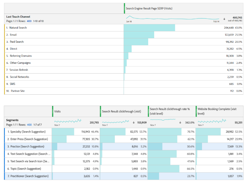
I then engaged our Growth specialist to review data from Adobe Analytics relating to search. Key findings were as follows:
The search bar completion rate on mobile is significantly lower than on desktop at 83% vs 94%.
90% of users landed directly on the search page through Google or email with a pre-filled search bar, so there is a higher likelihood that they needed to refine their location search.
When performing a search, 30% of users clicked on the “Enter” button, which led to a free text search. This resulted in 30% lower booking conversion rate compared to users who click on a search suggestion.
Usability test

I conducted a usability test to further investigate usability issues with the search experience. Through Askable, I recruited 5 participants to visit our office for the test.
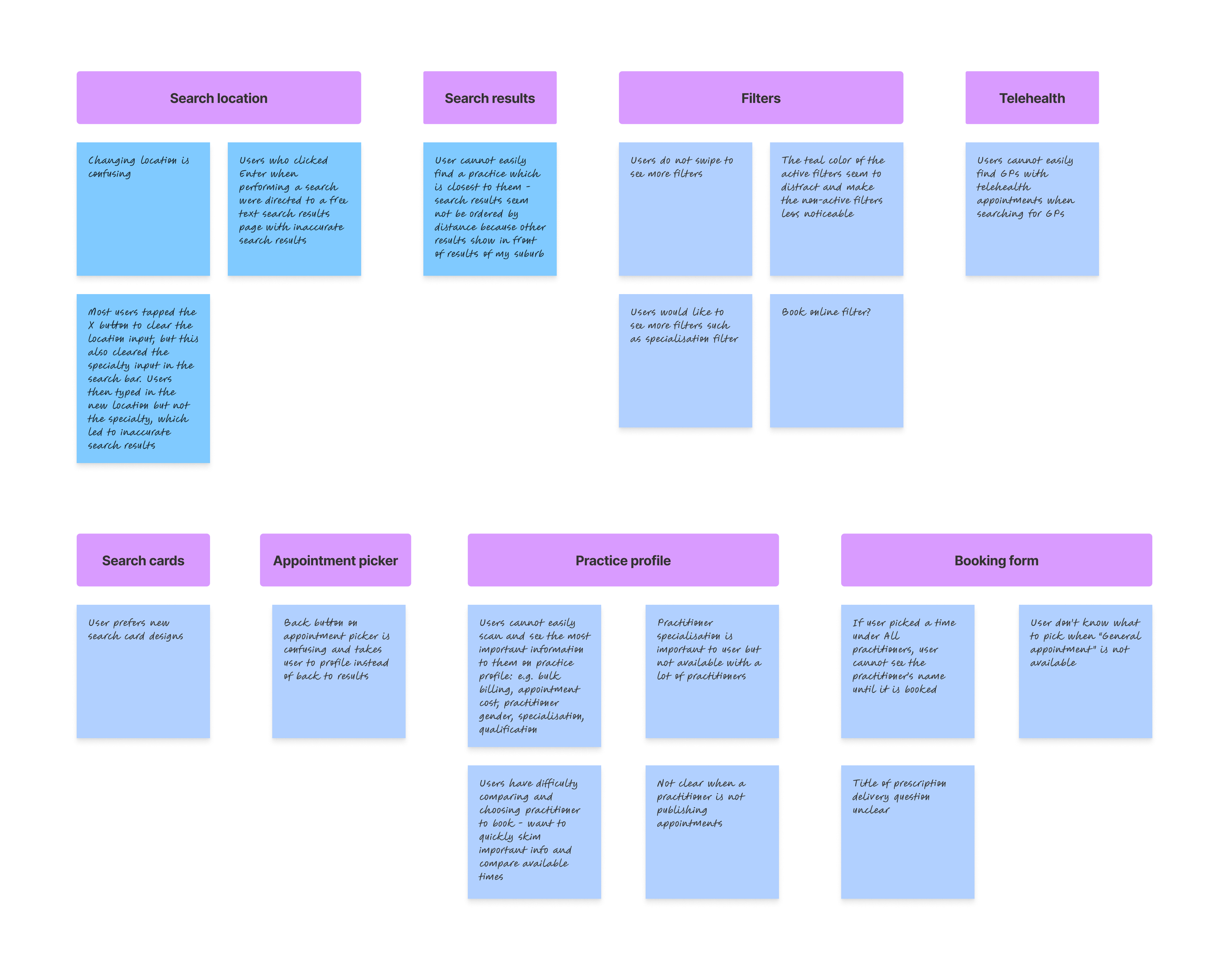
The usability test revealed several major pain points relating to search:
Users had issues with changing search location. When changing location, most users tapped the “X” button to clear the location input, but this also cleared the specialty input in the search bar. Users then typed in the new location but not the specialty, which led to inaccurate search results.
Users who tapped “Enter” when performing a search were directed to a free text search results page with inaccurate search results
The usability test also uncovered other pain points, such as issues with the search results page, filters, practice profile and booking form.
Design & Deliver
Ideation
I presented the insights gained from the data analysis and the usability test to the Head of Product, the marketplace team and the growth team, and aligned with them to prioritise addressing the search issues.
I then ran an ideation workshop on:
How might we improve the search experience to allow users to easily edit search location while ensuring accurate search results for those who land on our search page with a pre-filled search bar from Google?
Based on the results of the workshop and subsequent discussions, we agreed on the following approach to move forward:
Split the search bar into separate specialty and location components
Deprioritise the free text search function and require user to select a search suggestion to complete search
Improve the search suggestion experience to help users select the relevant search suggestion
Design
I started with rough sketches and created several solutions for the pain points.

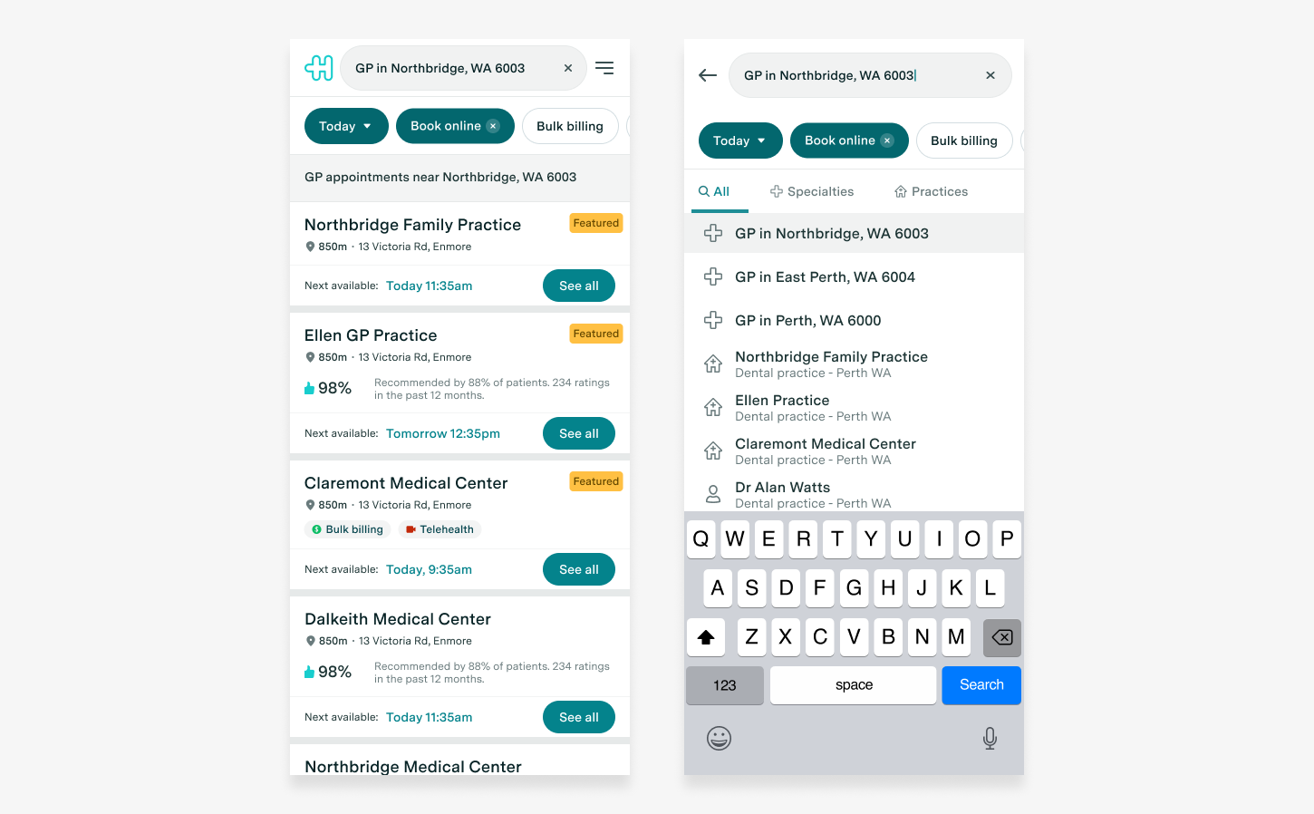
I shared these solutions with the cross-functional team for feedback and iterated the designs based on their feedback. I then jumped into Figma to create the Hi-Fi mockups and an interactive prototype, which I tested with another 5 users to refine the designs further.
Before

After
Experiment
After finalising the designs, I collaborated with the Growth specialist to create an experiment plan with clear metrics to track.
Outcome
The experiment was a success and was implemented across desktop and mobile web. By prioritising user feedback and focusing on key pain points, we were able to achieve significant improvements in user experience and business metrics.
The impact of this project?
Search completion rate on mobile increased from 80% to 95% on mobile
Overall booking conversion rate increased by 5%
Hotjar survey non-positive responses decreased by 40%


